Building an "Animated Bar Chart"
For this example, we'll assume that we want to show a bar graph with four vertical
bars that "grow" into place. Please open Authorware and construct this program
as you go through the tutorial.
You can download a sample of the described program here,
if you'd like to compare it to your own. (Authorware 5 format, < 9 Kb.)
Open a new AW file.
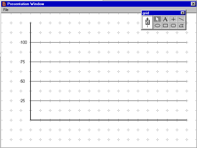
- Drag a Display Icon to the flowline and label it "grid."
- Open that Icon, and from the "View" menu, select "Grid" and Snap to Grid."
- (For our sample, we'll use graph bars that rise to 25, 50 , 75 and 100 (units
can be anything that you like, as can the actual numbers and number of bars.))
Draw a horizontal and a vertical axis and draw horizontal lines (at grid markers)
for the four heights. This Icon will be used initially to set the motion of
the four bars. (see Fig. 1. You may label these chart lines if you like.)
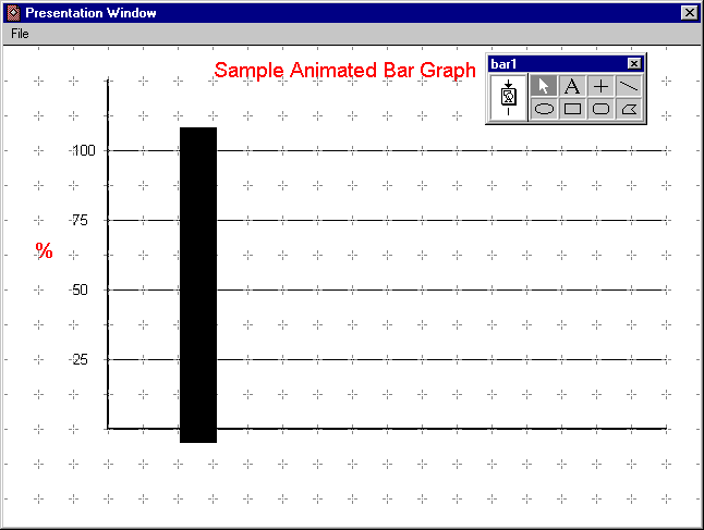
- Drag another Display Icon to the flowline below the first one, label it
"bar 1" and "Shift/double-click" to open it and leave the "grid" on the screen.
- Using the Rectangle tool, draw a bar that is one grid space wide and taller
than the !00 line on the grid. Using the "Inspectors/Colors" pulldown, set
the bar fill to some distinctive color.
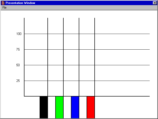
- Add three more Display Icons. In each place a similar, but differently colored
bar.
- Set the bars a uniform distance apart and move all so that their top surface
aligns with the horizontal axis of the graph.
- Add a Display Icon to the bottom of the flowline, label it "Aligner" and
run the program. The program will stop when it gets to the empty icon.
- Place vertical lines along the grid marks, just alongside the four bars.
You'll use these to set the motion of the four bars so that it will be perfectly
vertical. (see illustration.)
- Place four Motion Icons on the flowline below the bars and label them (1,
2, 3, and 4 will work for the labels.)
- Run the program. When the program gets to the first Motion Icon, it will
stop and open the following dialog box:
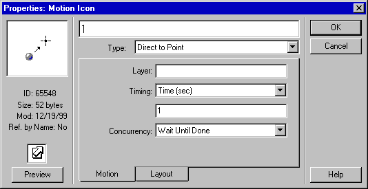
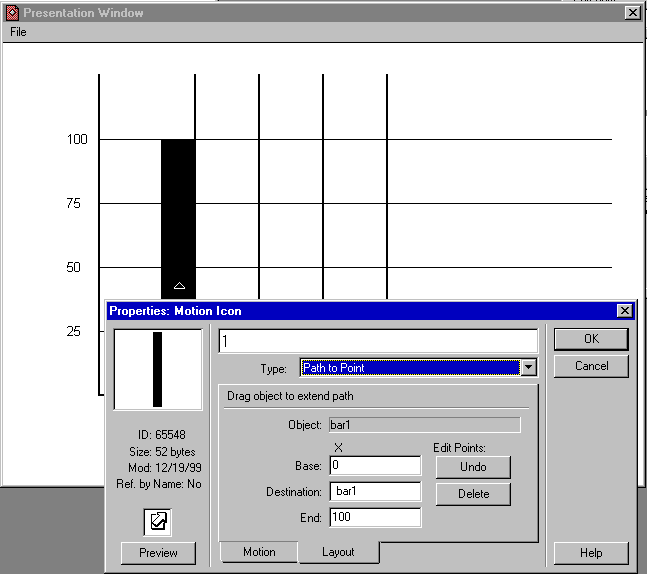
- Change the "Type" to "Path to Point" and click on the "Layout" tab.
- You will see the instruction "Click on object to be moved" in the middle
of the "Layout" tab. Click on the first bar.
- The instruction will change to "Drag object to create path." (You may have
to drag the dialog box out of the way. It is ok to do so!) Drag the first
bar up until its edges are perfectly aligned with the vertical "Aligner" bar
and with the "!00" horizontal grid line.
- Then type in "bar1" without the quotation marks in the space provided for
"destination." (What you have done: the "path" that you created starts where
the bar started and, according to the dialog box, is given a value of 0; the
path ends at the point to which you dragged the bar and has a value of 100;
and the "destination," the spot to which the Motion Icon will drag the bar,
is a position that is called "bar1". We have not yet defined that position,
but will do so immediately.
- Click on "OK." When you do so, the "New Variable" dialog box will open.
In the "value" box, type in the value that will be given to the first bar
(25). In the "Description" box, type in a phrase or sentence that will remind
you or another author what it is that this variable stands for.
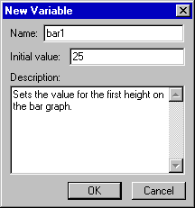
- Click on "OK" in the New Variable box and repeat the above steps when the
other three Motion Icon dialog boxes open. Be sure to 1) type the "Destination"
bar2, bar3 and bar4 in the Motion Icon dialog boxes and to 2) enter the values
50, 75, and 100 for the "Initial Values" in the respective "New Variable"
boxes.
- Run the program. You will see that it is essentially complete save for a
few "cleanup" chores.
- You'll next want to delete the "Aligner" Display Icon, as it has server
its purpose, and you really do not want those vertical lines there.
- To see the reason for the next couple of steps, run the program as it is
now. As you see, the bars are showing below the bottom of the chart, and they
seem to "overlap" the lines on the chart.
- Place another Display Icon at the bottom of the flowline and label it "Cover."
This will contain a rectangle that is the same color as your file background:
that rectangle will cover up the bars when they are below the graph.
- Run the program. It will stop at the new empty Icon. Draw a filled rectangle
that covers from the horizontal axis of the graph to the bottom of the presentation
window.
- Close the presentation window, click on the "Cover" Icon, and select "Modify/Icon/Properties."
Set the "Layer" box to 1 and click on "OK." This will force the "Cover" rectangle
to truly "cover" the bars. Then move the "Cover" Icon to just below the "Grid"
Icon on the flowline.
- Click on the "grid" Icon and select "Modify/Icon/Properties." Set the "Layer"
box to 2 and click on "OK." This will force the grid lines to appear on top
of the bars and the cover.
- The program should be functionally complete now. You may add appropriate
text to the "grid" Icon to identify the purposes and scales of the chart.
You can download a sample of the described program here,
if you'd like to compare it to your own. (Authorware 5 format, < 9 Kb.)
Return to Tutorials Page